Charts and visualization
Six chart types over a result set, with stacking, without leaving the tab.
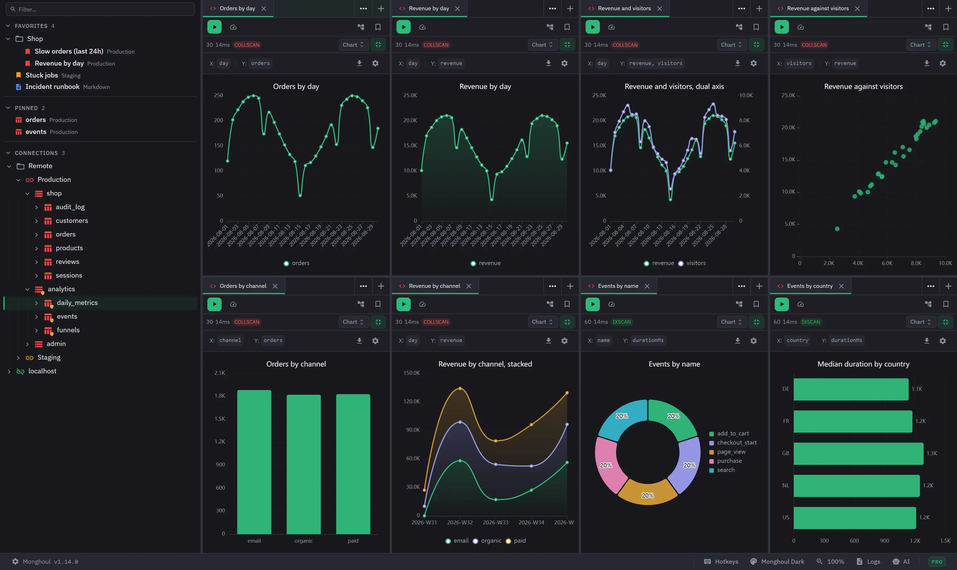
Charting draws a result as a bar, horizontal bar, line, pie, scatter or area chart in the same tab as the query. It needs a result that is a list of documents or objects. A single document, a list of plain values, a count, a write outcome and an explain plan have no Chart view.
A chart draws the loaded result and not the whole collection. The connection’s result cap (1,000 documents by default) therefore limits it. Raise it with Load 5,000, Load 10,000 or Load all in the result views, or group the data in an aggregation before you chart it.
On Free the Chart view is listed in the result-view switcher, dimmed and marked PRO, and clicking anywhere on it opens the upgrade dialog. In the compact view dropdown a narrow panel uses, the entry is simply unavailable. Saving a chart on Free is refused with a message that names the Pro requirement.
Configuring a chart
A result with no chart opens the configuration wizard. A result that already has one draws it and offers Configure to reopen the wizard. The wizard keeps a live preview beside the configuration panel and marks itself as computing while it catches up.
There are two modes, chosen from a toggle in the wizard header. Switching mode starts the other mode from the last saved chart, so an unapplied draft is discarded.
Easy mode starts from a preset and needs a preset, an X field and at least one value field before Apply becomes available. Advanced mode drops the presets and gives you a chart type (Bar, H-Bar, Line, Pie, Scatter or Area), field mapping, several measures, grouping, aggregation, sorting, labels, legends, data limits, stacking, a trend line and dual axes. It needs an X field and every value row filled. Cancel is offered only when there is a saved chart to go back to.
Presets
Eight presets are grouped as Time Series, Comparison, Distribution and Correlation, and each states what it draws:
- Time Series plots a value against a date as a line.
- Trend Analysis plots up to three metrics against a date as averaged lines.
- Category Breakdown compares a value across categories as bars.
- Top N ranks categories by value as horizontal bars, highest first, limited to ten.
- Multi-Series compares up to four metrics side by side.
- Stacked shows the components of a total, and needs a field to stack by.
- Distribution shows proportions as a pie, counting rather than summing by default.
- Correlation plots two numeric fields against each other as a scatter.
Choosing a preset clears any fields already picked. No field is ever chosen for you.
A preset also sets its own defaults. Time Series, Category Breakdown, Top N, Multi-Series and Stacked sum their values. Trend Analysis averages them. Distribution counts and turns value labels on. Top N turns the legend off. Correlation uses no aggregation.
Fields
Fields are discovered from the result and offered as dotted paths through nested objects. Array-valued fields are not offered.
Each field is typed as numeric, date, text or boolean. The picker states the type, how many distinct values the field holds, its numeric range and its date range. Fields matching the type the control wants come first, but any field can be chosen. A field another value row already uses is marked as in use and stays selectable.
Numeric detection recognises MongoDB’s own numeric types, so a 64-bit integer or a decimal column plots its real values instead of reading as text. Date detection recognises ISO date strings, and date-like values in a field whose name reads as a date or a timestamp.
Aggregation and grouping
Aggregation is No Aggregation, Sum, Count, Average, Minimum or Maximum. Without aggregation the first value in a bucket is used. Count counts every document in the bucket whatever the value’s type, while the other aggregations ignore values that are not numbers.
Grouping by several fields joins their values into one series name. A missing group value shows as null, and two series that would otherwise share a name are numbered apart.
Dates group by hour, day, week, month, quarter or year. The interval is suggested from the range the data covers, and you can change it or turn it off. Buckets are formed in local time, and week buckets start on Monday and are labelled by ISO week. Choosing a different date field keeps the interval and re-targets it. Choosing a field that is not a date clears the grouping.
Sorting and limits
Sorting is Default, Ascending or Descending. Choosing a direction reveals a Sort by control, which offers Value, the first series’ aggregated value and the default, and Label, the category name compared as text. Each Y field is listed as well once there are two or more, so a chart can be ranked by a measure other than the one drawn first.
A date x-axis is never re-ordered, because its order is the timeline, and a date-grouped chart ignores the sort setting for the same reason.
The data limit is no limit, or the top 5, 10, 20 or 50. Neither sorting nor the data limit is offered for pie or scatter charts.
Axes, colours and labels
Dual Y-axis appears once two or more value fields are filled, on any chart other than pie or scatter. It lists each series so you can put one on the right-hand axis, and turning it on assigns the last series there.
Show Legend is on by default, Show Labels is off by default, and a title is optional. In advanced mode, Stacked shows for bar, horizontal bar and area charts, and Trend Line shows for scatter charts. Series colours come from the active theme’s chart palette and cycle through it. There is no per-series colour control, and the palette keeps the series distinguishable inside the theme.
The chart names its axes and settings above itself: the X and Y fields, and on a wide enough panel the aggregation, the date interval, whether the axes are split, any top-N limit, and the number of categories with their total.
Reading a chart
Hovering shows the values under the pointer, and clicking a legend entry toggles its series. Large numbers are abbreviated with K and M on axes, labels and tooltips.
A chart adapts to how much it has to show. Category labels rotate once there are more than ten, a zoom slider appears past thirty, scroll and pinch zoom the plot, and long horizontal-bar labels are truncated.
Pie charts draw a single series as a donut, one slice per category, with percentage labels when labels are turned on. Where the label sits depends on the room there is. A wide enough panel writes it outside the ring with a leader line. A narrow panel writes the percentage on the slice, because an outside label needs more width than a small panel has beside its legend, and the category name then comes from the legend or the tooltip. Two outside labels never draw on top of each other: where they would, the second is left out and the legend still names its category.
Scatter charts can show a linear trend line, fitted per series and dashed, and left out of the tooltip. A series with fewer than two points, or with no spread along the X axis, gets none.
Exporting
The Export button in the chart toolbar saves a high-resolution PNG file, rendered at four times
screen resolution onto the theme’s background colour. The save dialog proposes a name built from the
chart title and the date, such as chart-monthly-sales-2026-10-01.png. Without a title it is
chart-export and the date. Dismissing that dialog exports nothing and says nothing. A failed write
is reported.
What persists
Chart configuration is stored with the tab and with favorites, and it survives re-running the query, including a re-run that returns nothing. Leaving the Chart view discards an unapplied draft but keeps a saved chart. Charts support tab and window fullscreen, as every result view does.
A result with no documents says so in place of the chart. A configuration that cannot be drawn says so and offers to reopen the wizard rather than leaving the panel blank.
A chart configured by an AI assistant appears in the tab immediately and switches the panel to the Chart view. It closes an open wizard only when the configuration actually differs.
On a narrow result panel the wizard stacks its configuration above the preview, the toolbar drops its detail line, and the export and configure controls become icons.