Themes and appearance
Eleven built-in themes and an editor that generates a whole token set from one brand colour.
The eleven built-in themes
The same workspace in each one. On first launch the app picks Monghoul Dark or Monghoul Light to match the operating system, and then stays on what you chose.
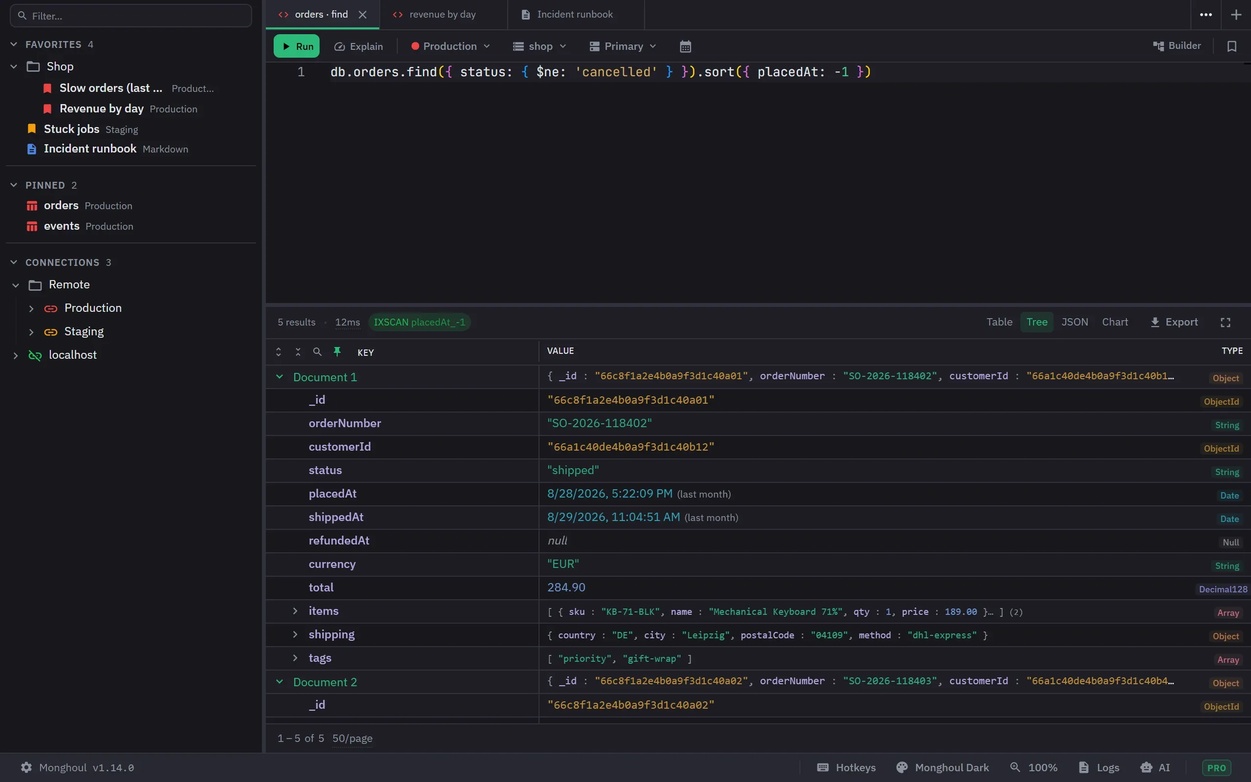
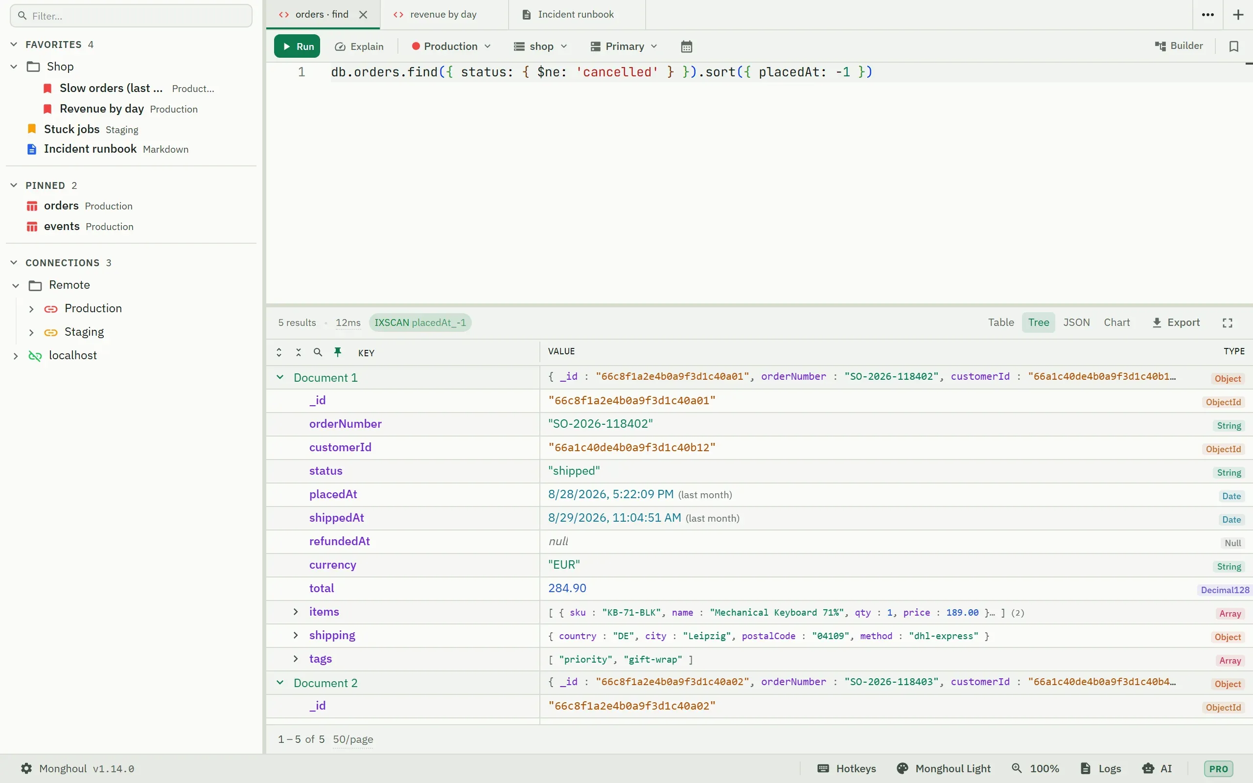
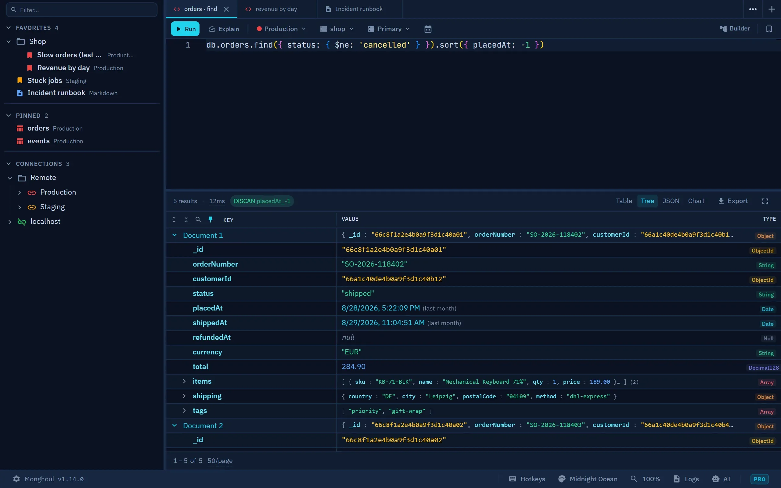
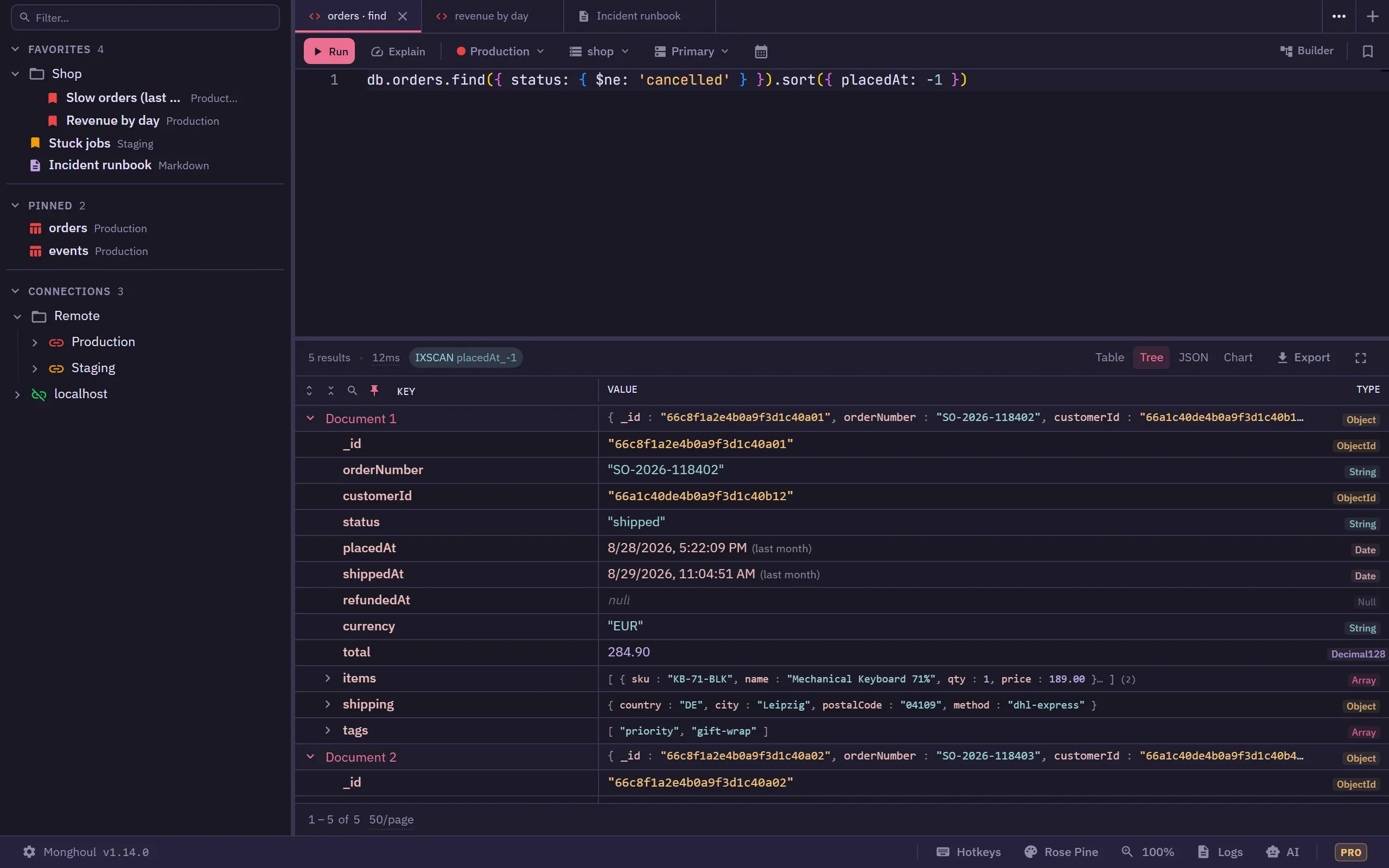
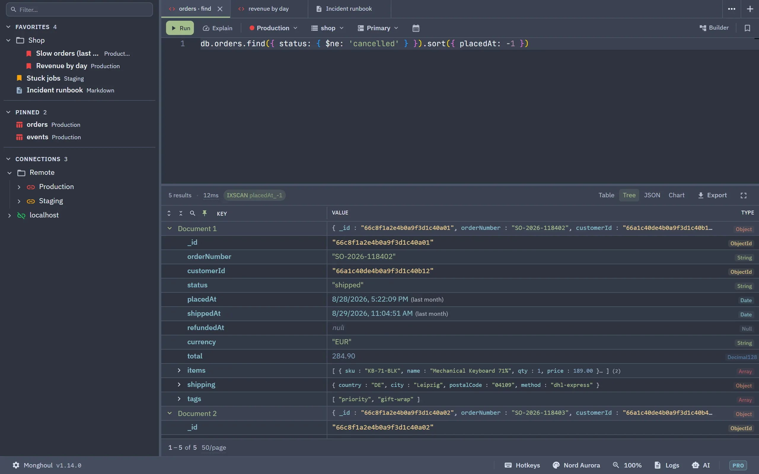
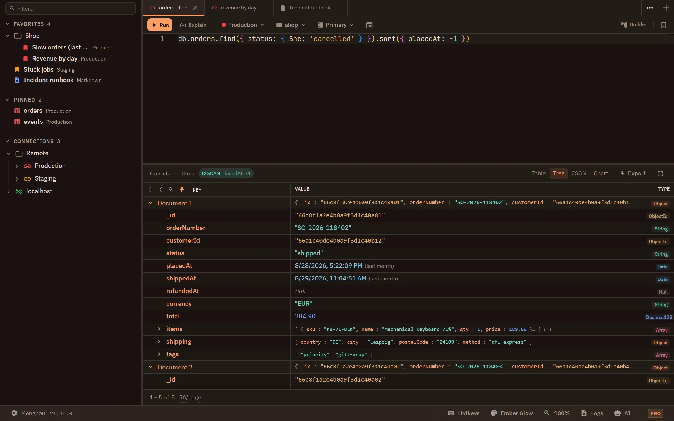
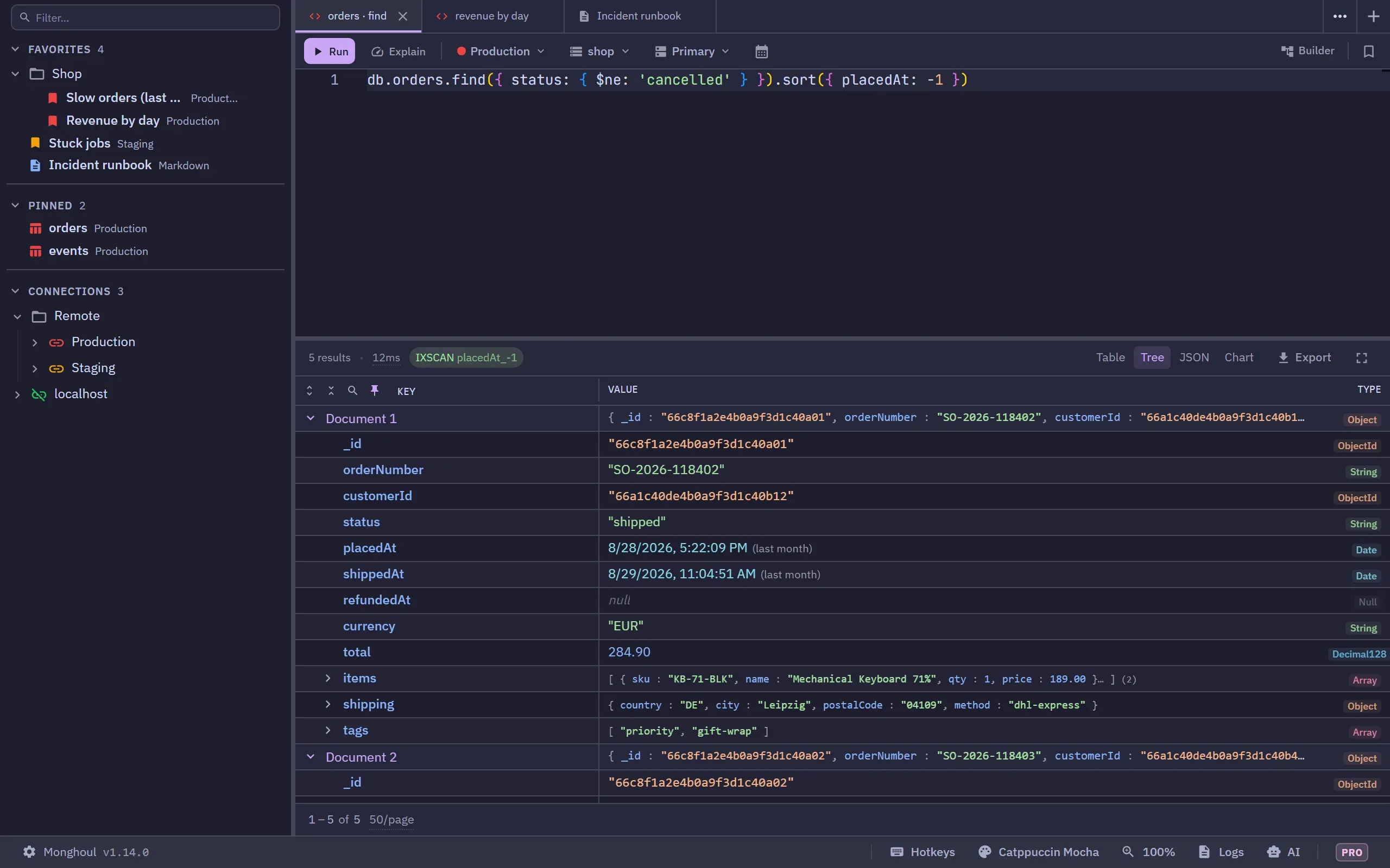
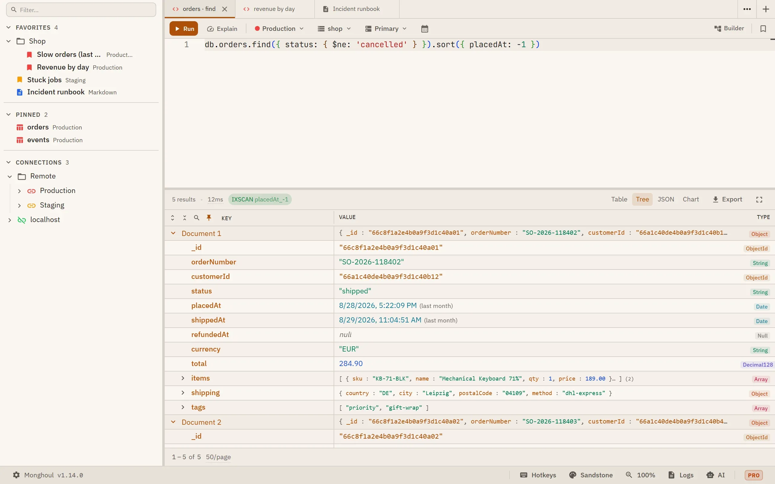
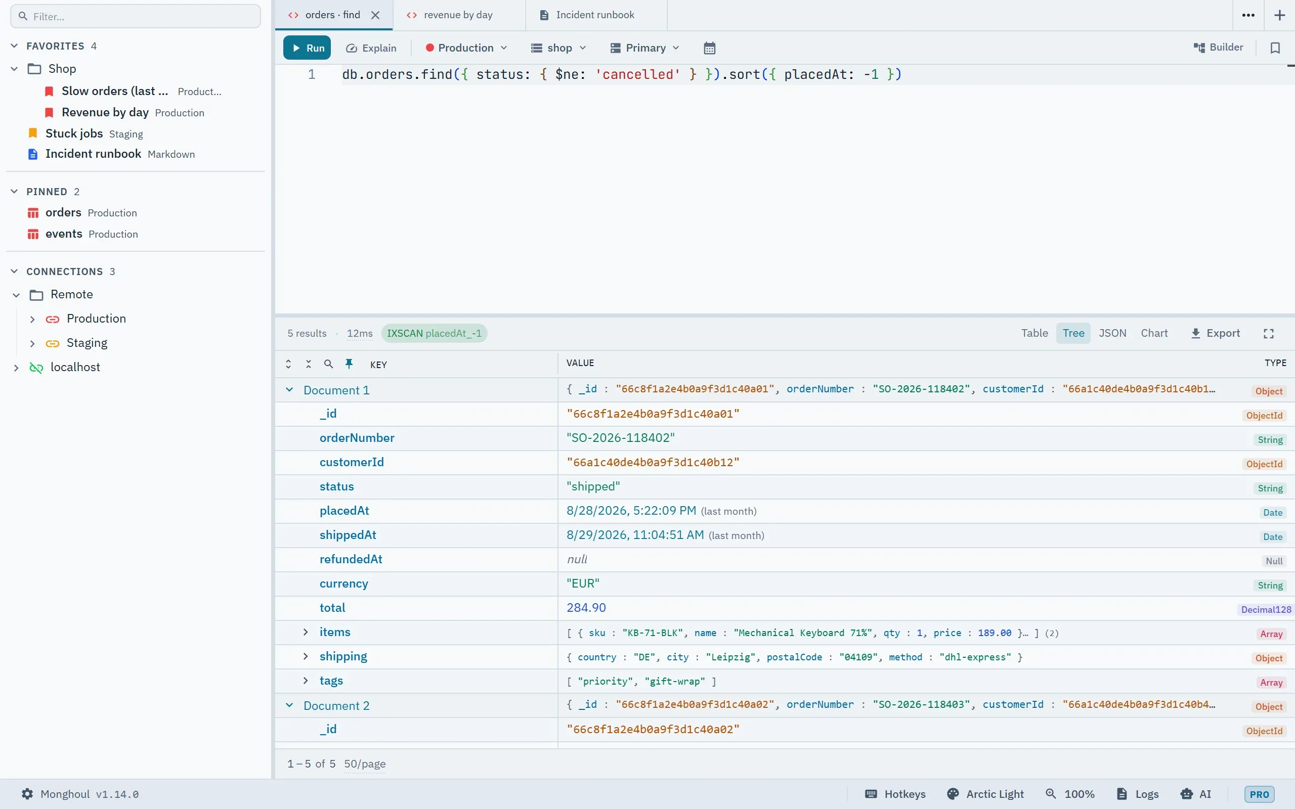
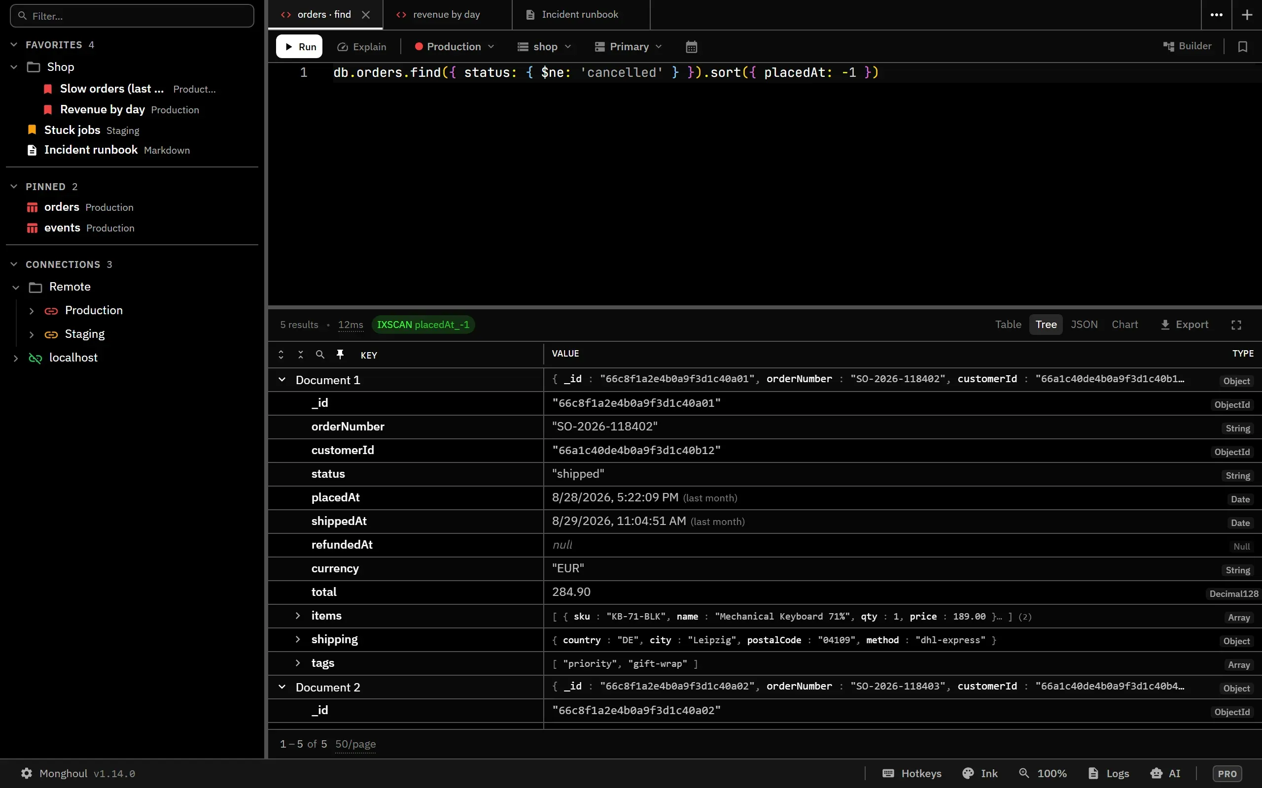
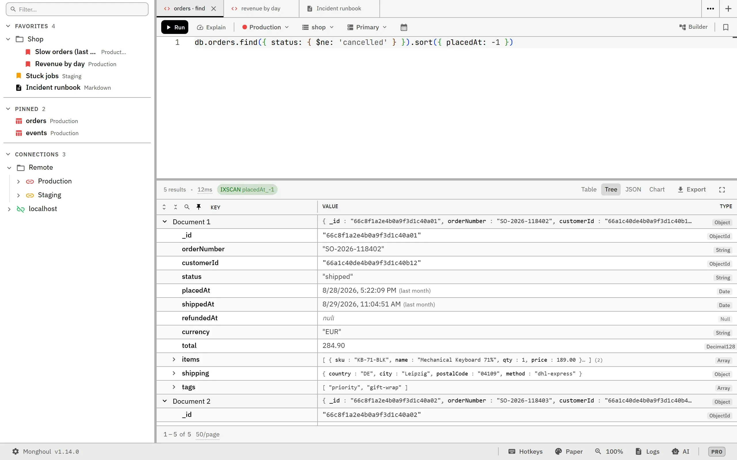
Every built-in theme meets WCAG AA contrast on every surface it paints: 4.5:1 for text, and 3:1 for non-text indicators such as chart series. Inside a theme the chart series are guaranteed distinguishable from one another. The query editor’s colours meet the same floors against the editor’s own background.
Each theme carries a brand accent for tier badges and highlights, kept distinct from the primary action colour and from the status colours. Search matches have their own colour too, distinct from the selection colour and the warning colour, so a match inside a selected row stays readable.
The status bar’s theme menu lists the built-in and custom themes separately, with a colour preview of each. Changing theme applies instantly across the app, the code editor included. Nothing restarts.
The theme editor
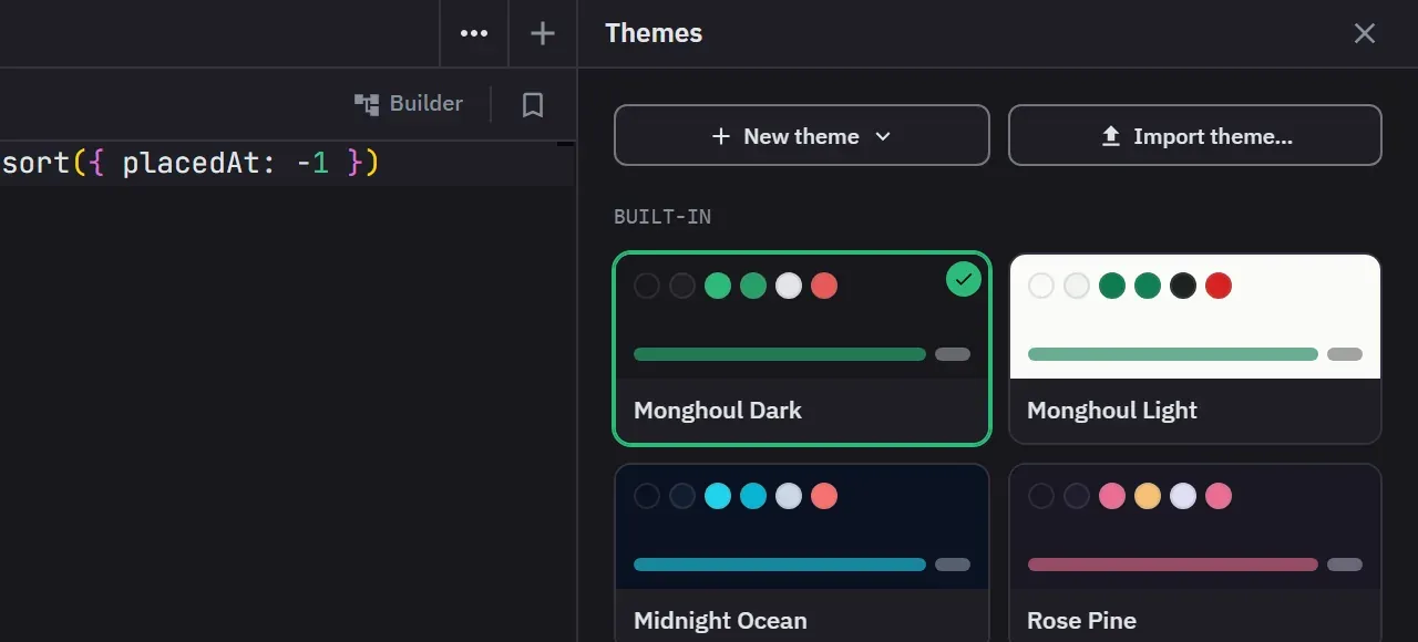
Customize Themes… in the status bar’s theme menu opens the theme editor, and it opens as a library. Clicking a theme applies it and stays in the list. Each theme’s menu holds Duplicate and Export, plus Customize a copy on a built-in theme or Edit on a custom one. A custom theme’s menu also has Delete, and every delete asks for confirmation first. Deleting the active theme switches to Monghoul Dark.
Saving a custom theme is a Pro feature, and so is Duplicate. On Free you can open the editor and try everything, and the library says up front that saving needs Pro.
New theme generates a whole theme from one brand colour. Type it, take one of ten swatches, or press Surprise me for a random brand, style, accent and surface. Then choose:
- A base: Light, Dim, Dark or Black. Each base solves the background to one depth, so a yellow brand and a blue brand get equally dark grounds.
- A style: Balanced, Vibrant, Soft, Tonal or Mono. Each one is a tile that shows the theme in that style, painted from your brand.
- High contrast, which raises the text, the brand, the status colours, the BSON type labels and the JSON syntax colours to at least 7:1 on the two main surfaces.
- More options: the accent (Auto, Analogous, Complementary, Triadic or a custom colour), the surfaces (Brand tint, Warm, Cool, Neutral grey or a custom background) and the text colour. Each one stays on Auto until you pick it.
While you pick, the form paints the whole app with the theme it would generate, the code editor included. The Live preview checkbox turns that off. Nothing is saved while it paints, and closing the form or the editor puts the active theme back.
The base starts from the system appearance. Choosing another base drops a background or text colour you picked, and derives both again. A grey brand gives neutral surfaces and neutral text.
Customize a copy opens a built-in theme as a copy named after it, such as Nord Aurora (Custom), under a notice that saving creates a new custom theme. The save button reads Create & apply for a new theme and Save & apply for a custom theme you edit, and both make the saved theme active. Ctrl/Cmd+S saves too.
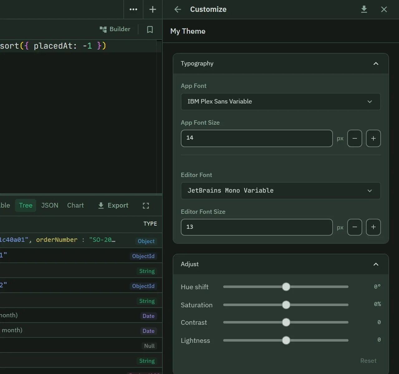
From there every colour is editable. They are grouped as Core, Surfaces, Borders, Status, Interaction and MongoDB type colours, alongside typography and a palette section that regenerates the theme. Regenerate Colors moves all of them, the type colours and the section colours included, and keeps the style, accent, surface and high-contrast choices.
Typography sets the app font and size and the editor font and size. The app size goes from 8 to 24 px and the editor size from 8 to 28 px, and each size field has minus and plus buttons.
The Adjust section changes every colour at once, with hue shift, saturation, contrast and lightness sliders. A hue or saturation move keeps the contrast each colour had. The contrast and lightness sliders show a warning with the measured ratio when text falls under 4.5:1. Slider results save as ordinary colours, so an exported theme stays plain JSON.
Every edit and every slider drag is one undo step, on the undo and redo buttons and on Ctrl/Cmd+Z and Ctrl/Cmd+Shift+Z. The keys act while the focus is in the editor, so a query tab behind it keeps its own undo. Once the draft has unsaved changes, a hold-to-compare button and a Revert button appear. Hold the compare button to paint the theme as it was before you started editing. Revert puts the draft back to how the editing session started.
Each colour picker offers Pick from screen, an eyedropper, where the platform provides one. Hovering a colour’s swatch makes everything painted with that colour brighten and dim, so you can find where a colour is used without losing sight of what it looks like. The flash is skipped when the system asks for reduced motion.
A custom theme covers the app colours, the semantic and interaction states, the MongoDB value types, typography, editor syntax, result views and index badges. Monaco is themed with custom token rules, so the code editor matches the rest of the app instead of approximating it.
Generated colours are fitted to the same contrast floor the built-in themes meet, on a light background as well as a dark one. A colour that already clears the floor is used as picked. One that does not moves in lightness only, and keeps its hue and saturation. When a colour you picked had to move, the line under its field says so and names the colour it became.
Closing the editor or going back to the library with unsaved changes asks for confirmation first.
Themes import and export as JSON files, which is how you share one. An imported theme is an unsaved draft, so saving it needs Pro. A built-in theme cannot be renamed, edited in place or deleted, so Customize a copy is the way to change one. Export is on each theme’s menu, and the editor’s header exports the draft you have open. A notification gives the path of the file. Import theme… in the library opens the file as a new unsaved theme, and adds a number to its name if that name is taken. A file without a name and colours is rejected with a reason.